
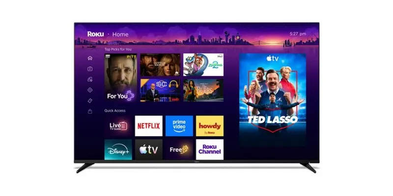
TLDR: WASHINGTON—Roku rolls out a redesigned home screen to US users with AI based Quick Access and a new “Top Picks for You” row.
Key Takeaways:
- Roku keeps its three column layout, but tightens left navigation icons and shifts apps into a more curated priority order.
- A new “Top Picks for You” row sits above “Quick Access,” where AI organizes your most used apps and adapts to routines.
- Daily Scoop and smarter shortcuts, plus continued manual control, turn Roku’s home screen into a personalized launch pad.

Roku is betting that “finding what you want” beats “showing everything.” The AI can adapt, but it still has to earn your thumbs.
Roku is betting that “finding what you want” beats “showing everything.” The AI can adapt, but it still has to earn your thumbs.
Q&A
How will Roku handle conflicts when AI puts an app in Quick Access but a viewer tries to override it?
Roku says you can still add or remove apps manually, so the tension will likely play out as a tug of war between your edits and ongoing AI adaptation.
What does Roku gain by moving from a flat app list to prioritized rows like “Top Picks for You”?
It shifts Roku from a tool for launching apps to a content discovery layer, which can increase engagement and reduce time spent searching.
Why keep the old three column layout while changing what sits at the top?
Familiar structure lowers churn, while repositioning content lets Roku test new priorities without confusing long time users.
Could “Your Daily Scoop” change viewing habits the way recommendations on major smart TV platforms already do?
Potentially, because a daily curated digest nudges routine behavior toward new shows and trends, not just whatever you already watch.
What happens if AI personalization improves convenience but makes some users feel less in control?
Roku’s manual customization is the safety valve, and future updates will likely focus on explainability or clearer controls if complaints grow.





No comments yet. Be the first to share your thoughts!