
Apple’s Barcelona flagship reshapes pickup flow after renovations
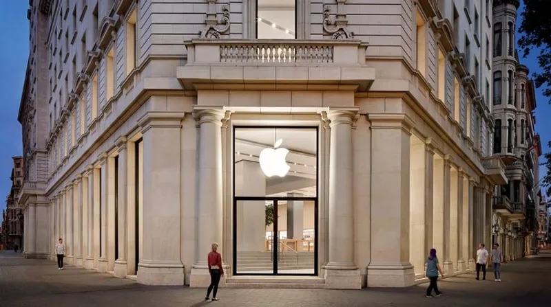
TLDR: BARCELONA—Apple reopened its Passeig de Gràcia flagship in Barcelona after roughly three months of renovations. A large video wall became an Apple Pickup station, while indoor trees and cube seating were removed, brightening the terrazzo and revealing the glass staircase again.
Key Takeaways:
- Apple’s Passeig de Gràcia store first opened in 2012 inside a former bank building on Barcelona’s busiest shopping street.
- Renovations replaced the large video wall with an Apple Pickup station for online orders and removed the indoor trees and wood cube seats.
- More pickup space and a cleaner layout signal Apple’s push to streamline retail workflows while keeping the landmark glass staircase front and center.

Apple’s Barcelona reopening is less about flash and more about logistics. By turning the centerpiece screen area into a pickup station, the store feels faster, but still keeps the drama where it counts, the glass staircase.
Apple’s Barcelona reopening is less about flash and more about logistics. By turning the centerpiece screen area into a pickup station, the store feels faster, but still keeps the drama where it counts, the glass staircase.
Q&A
Why did Apple swap a big video wall for a pickup station at this flagship?
A screen-heavy display competes with traffic flow. Pickup stations reduce waiting and make online orders feel immediate, especially in high volume retail corridors like Passeig de Gràcia.
What might this change imply for Apple’s other flagship stores?
If the pickup station improves throughput here, Apple can replicate the pattern by converting high attention zones into order collection points, then keeping showroom moments around distinctive architecture.
How does removing the indoor trees and cube seating alter the shopping experience?
It shifts the space from linger and browsing to guided movement. Less visual clutter can also make product interactions and the staircase feel more intentional.
What does the brighter terrazzo finish suggest about Apple’s design priorities?
Brighter materials can improve perceived openness and make spaces feel cleaner and more modern, which supports a retail experience optimized for quick pickup and in store demonstrations.
Will the glass staircase become a more central marketing moment now that the screen area is gone?
Likely yes. With fewer competing focal elements, Apple can lean harder on the staircase as a signature photo and brand landmark while directing customers toward pickup and product areas.





No comments yet. Be the first to share your thoughts!