
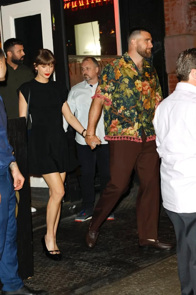
TLDR: NEW YORK—Taylor Swift and Travis Kelce coordinated looks while diverging styles, including a New York dinner at Sartianos and a minimalist turn toward The Row.
Key Takeaways:
- Their three year romance shows synced labels, logos, and color, flipping between playful maximalism and cleaner silhouettes.
- Swift leaned into Stella McCartney and Dior with Cartier and her engagement ring, while Kelce wore a Valentino floral linen shirt and tassel loafers.
- Swift swapping florals for monochrome signals a pre wedding wardrobe reset, yet her Dior and Cartier staples keep the Easter eggs.

Their outfits read like a relationship contract: same brand energy, different grammar. The fun is watching Swift get quieter in her closet without getting less specific.
Their outfits read like a relationship contract: same brand energy, different grammar. The fun is watching Swift get quieter in her closet without getting less specific.
Q&A
If Swift is moving more minimal, what happens to her logo and color traditions when she steps out at wedding related events?
Expect tighter styling with fewer loud elements, not a full retreat from signature accessories like Cartier or statement jewelry tied to the engagement.
Why does matching labels matter more than matching outfits for celebrity couples like Swift and Kelce?
Label alignment signals shared taste and access, while silhouette differences let each person keep a distinct public identity.
How might Kelce’s streetwear lean influence menswear visibility in mainstream luxury during wedding season?
His mix of brand heavy pieces with playful textures can push more menswear buyers toward bold patterns and seasonal tailoring instead of safe basics.
What does Swift choosing The Row style cues over sequined maximalism suggest about her fashion risk tolerance?
She appears ready to trade spectacle for precision, using monochrome and clean lines to make the same level of impact through fit and fabric.
Could coordinated couple styling become harder if Swift’s wardrobe keeps shifting toward monochrome?
It will likely get selective, with Kelce anchoring in color or print while Swift keeps a controlled palette, so the contrast stays intentional rather than accidental.
Top in Fashion

Dr. Cheyenne Bryant turns The Abbey anniversary into style pressure

Vogue bets on black dress silhouettes all summer

Cannes red carpet swings from vintage pulls to runway now

Swift and Kelce bring denim swagger to courtside

No comments yet. Be the first to share your thoughts!